Natura Sustainability:Web
And Mobile Design
The Natura project simplifies sustainable living with a user-friendly website. Through engaging visuals and interactive graphics, it empowers users to make informed decisions and adopt sustainable practices by offering product sustainability ratings, curated recommendations, and practical tips. Features like a product scanner and intuitive data visualization further facilitate informed choices and promote sustainable lifestyles.
Overview
Problem Statement
Many individuals find it challenging to adopt sustainable lifestyles due to a lack of accessible information and resources. The Natura project addresses this by providing a user-centered website that simplifies sustainable living and empowers users to make informed decisions
Key Challenges:
To present information in a clear and digestible format, avoiding information overload and enhancing user comprehension.
Incorporating readily available tools to support users in conducting efficient and expedient product research.
Developing with a focus on universal accessibility, ensuring a user-friendly experience for individuals across the age spectrum.
Design Process
1. User Research & Discovery
Initial research involved a two-pronged approach: analysis of existing sustainability websites and qualitative user research. The competitive analysis examined design and UX practices, including grid layouts, color schemes, and interactivity. User interviews were also conducted to gather insights from individuals interested in adopting sustainable lifestyles
Sample Research Questions:
Are you interested in living a sustainable lifestyle? Why or why not?
Have you used previous resources? What did you like about it?
What features would be most helpful in improving your experience?
How often would you take advantage of a resource like this?
The user interviews revealed a general consensus: while interested in adopting sustainable lifestyles, many individuals felt overwhelmed by the volume of information available. This often led to discouragement and a reluctance to pursue further research. Furthermore, users expressed a desire for solutions that could adapt to their existing lifestyles rather than prescriptive approaches. These insights directly informed the concept for the product scanner feature.
3. Prototyping & User Testing
With a well defined wireframe structure, I developed an interactive prototype in Figma and conducted usability testing with design peers.
Key Enhancements Based on Testing Feedback:
Improved Hierarchy: Users asked for more contrast in type sizes, and certain graphics to have more visual weight on the screens
Color Contrast: There was a soft green and cream color scheme but many reported that there needed to be a bit more contrast, so multiple shades of green were incorporated to give dimension.
Continuity: Users required more consistency across the pages and between the website and the mobile interaction. They felt as though the mobile was being condensed too much in terms of visuals, so I scaled everything to guarantee that they were the same
2. Ideation & Wireframing
After receiving insight from the interviews and research, I collected some layouts and key aspects that I wanted to include for the website that would address these issues
.
Key Design Considerations:
Visual Hierarchy and Flow: The interface design prioritizes a clean visual hierarchy and intuitive flow to prevent cognitive overload. This was achieved through strategic use of whitespace, clear visual cues, and a logical layout that guides the user's eye.
"Universal Accessibility through Visual Communication: The website's information and navigational flow were designed to be universally accessible. Visual elements, typography, and interactive components were carefully considered to ensure clarity and ease of use for users of all ages and varying levels of technological expertise.
After that, I developed user flow diagrams that informed the development of low-fidelity wireframes in Figma. This established the website's structure and layout. A color scheme was subsequently applied to enhance the visual design.
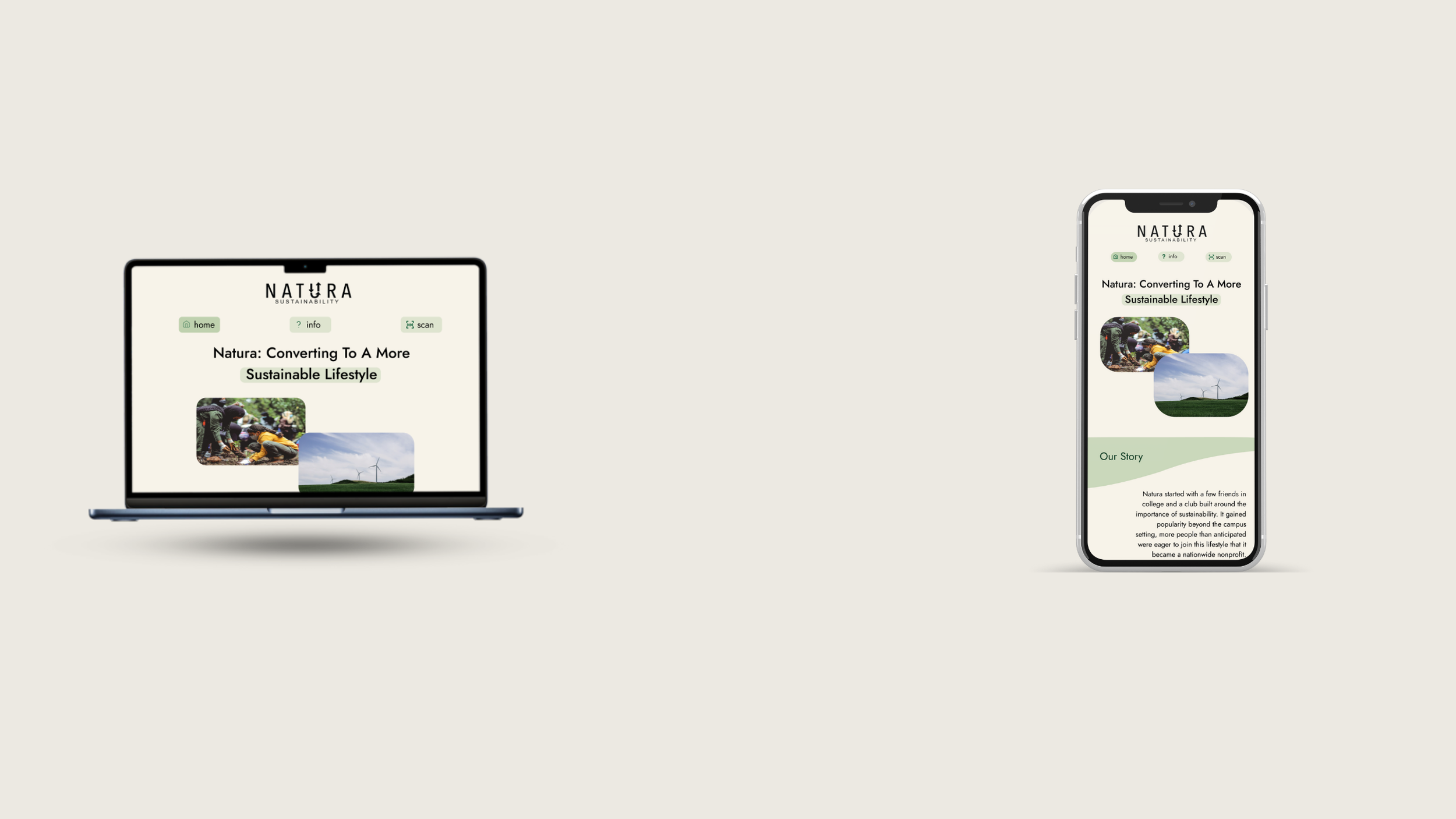
Final Solution
The Natura Sustainability website provides a seamless, informative user experience that encourages sustainable living in an approachable way.
Core Features:
Clean, easy access design that displays information outwardly.
Interactive information that provides personal information when needed..
Scanning feature to allow a personalize experience with product information
Natura Sustainability provides an accessible and informative resource for individuals seeking a sustainable lifestyle through a visually engaging and user-centered website. The design employs a clean aesthetic, intuitive interaction patterns, and personalized elements to simplify complex information and empower users.