Sun Bum: Typographic Media
Sun Bum, a well known sun care brand celebrated for its playful coastal aesthetic and iconic mascot, has experienced significant growth since 2010. This project, a typographic emulation of the Sun Bum brand, involved a detailed analysis of their visual language, specifically focusing on typography. Through comprehensive brand research and type study, I successfully emulated their established brand identity with typefaces of my choice, applicable across various platforms
Overview
Design Process
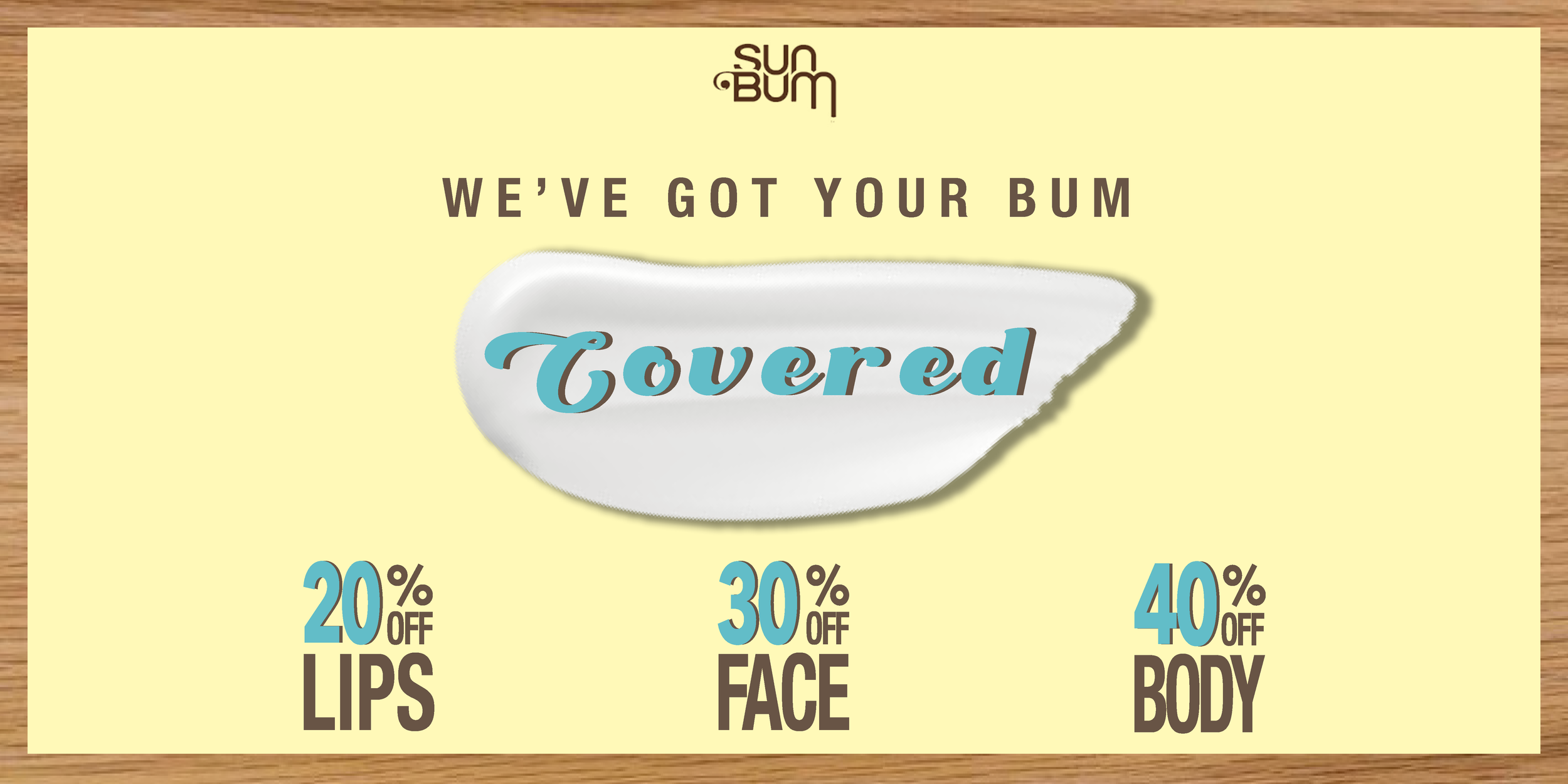
After analyzing the brand, I collected the Sun Bum color scheme, previous media post inspiration, and chose my typefaces so I can maintain the continuity across the platforms.
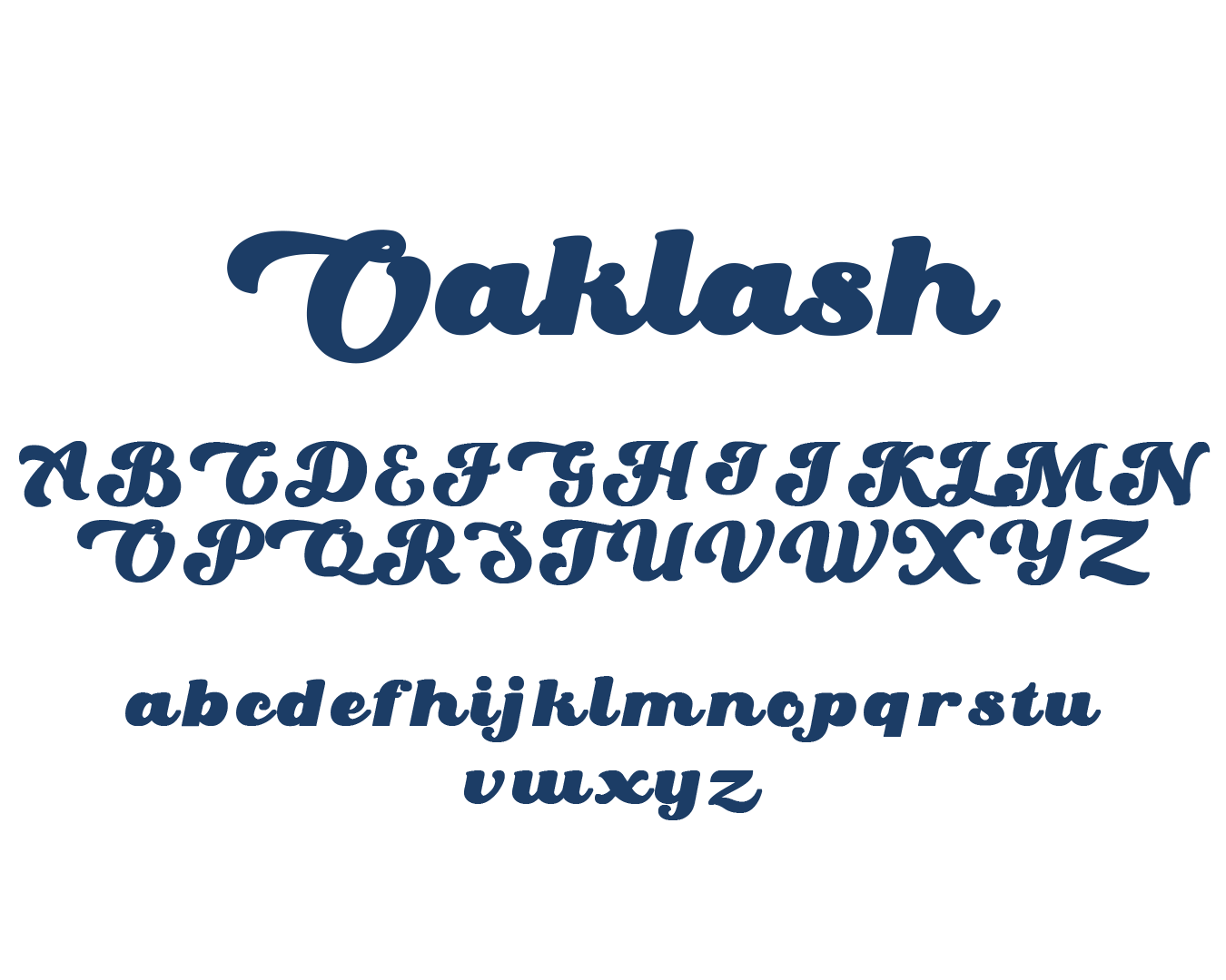
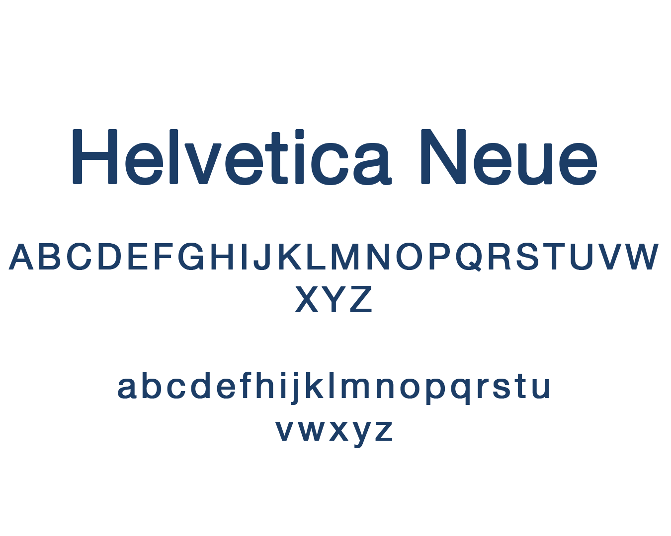
The visuals weren't the only element conveying the coastal feel; the typography also played a crucial role. I balanced a sans-serif (Helvetica Neue Condensed Bold) with a script font (Oaklash Regular) to create diversity and emphasis, ensuring readability across various platforms. Scalability was also a key consideration, guaranteeing that the design maintained continuity and legibility even on smaller screens.


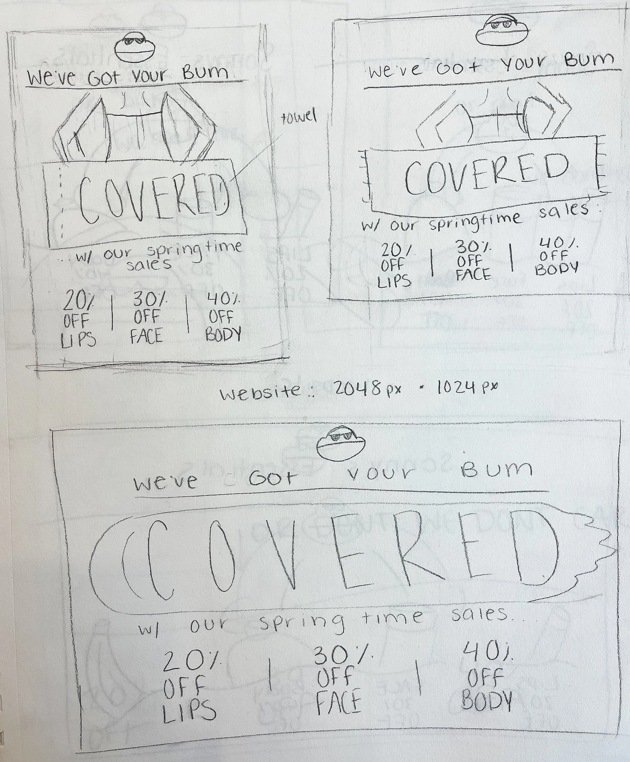
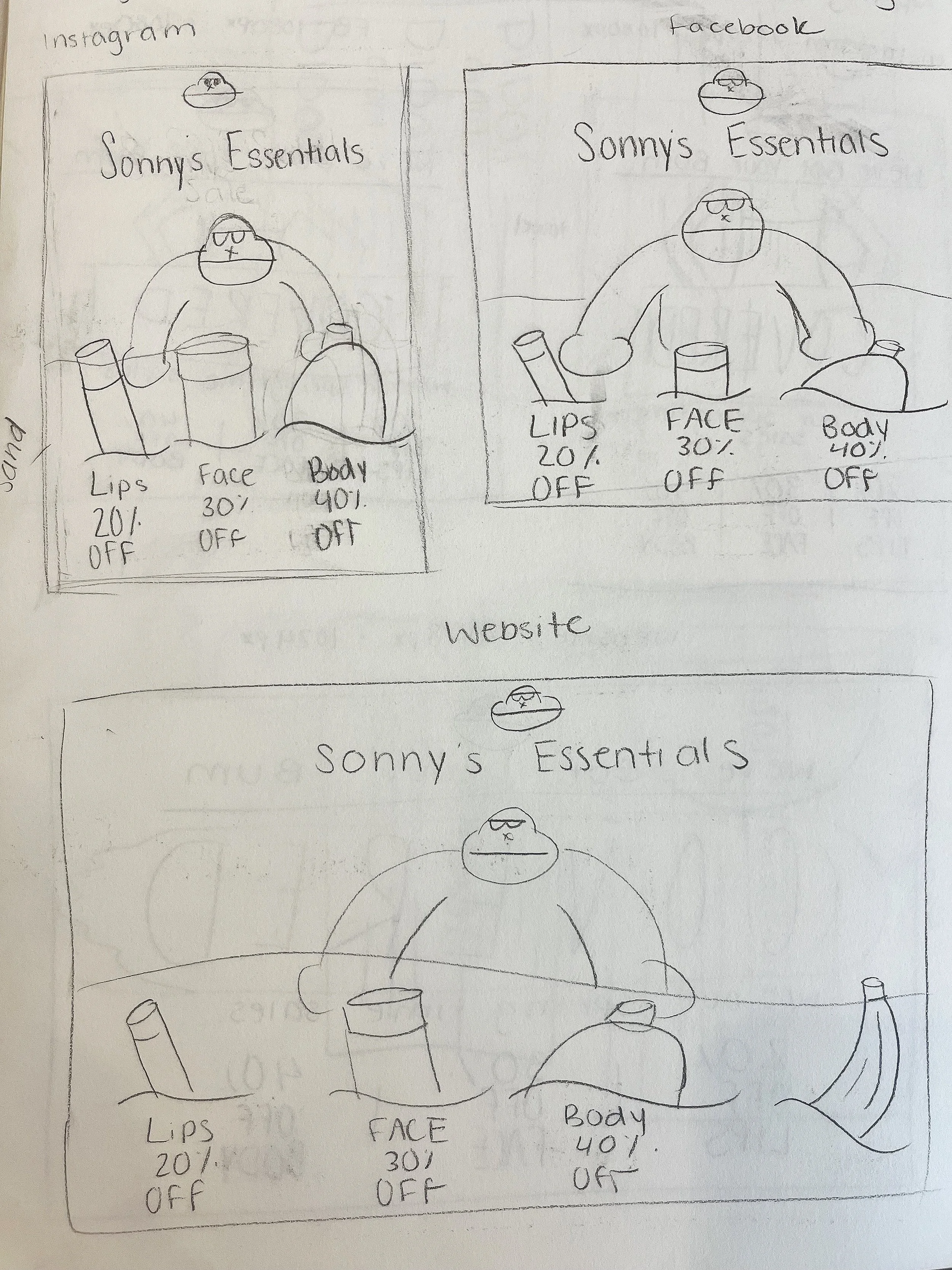
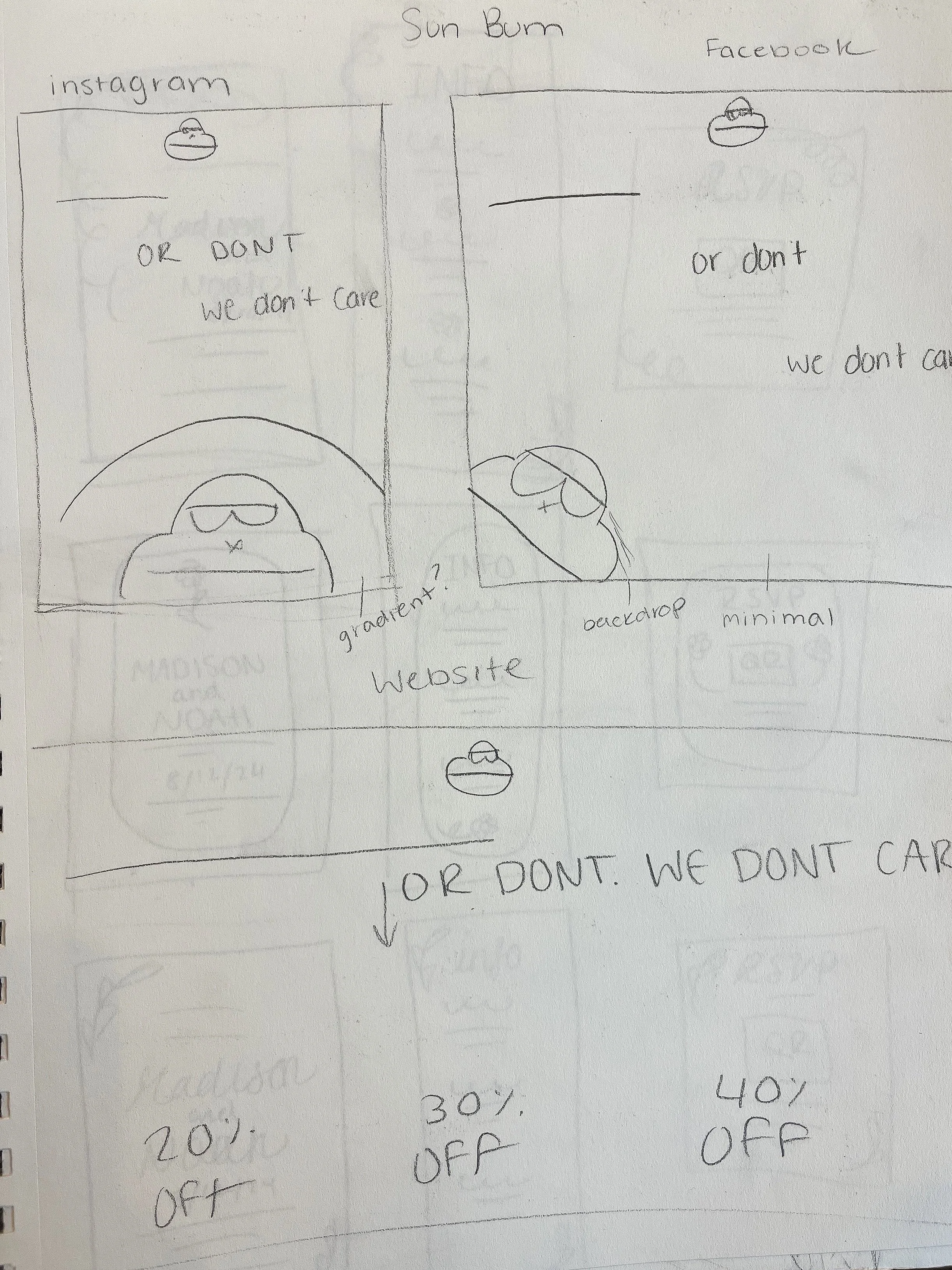
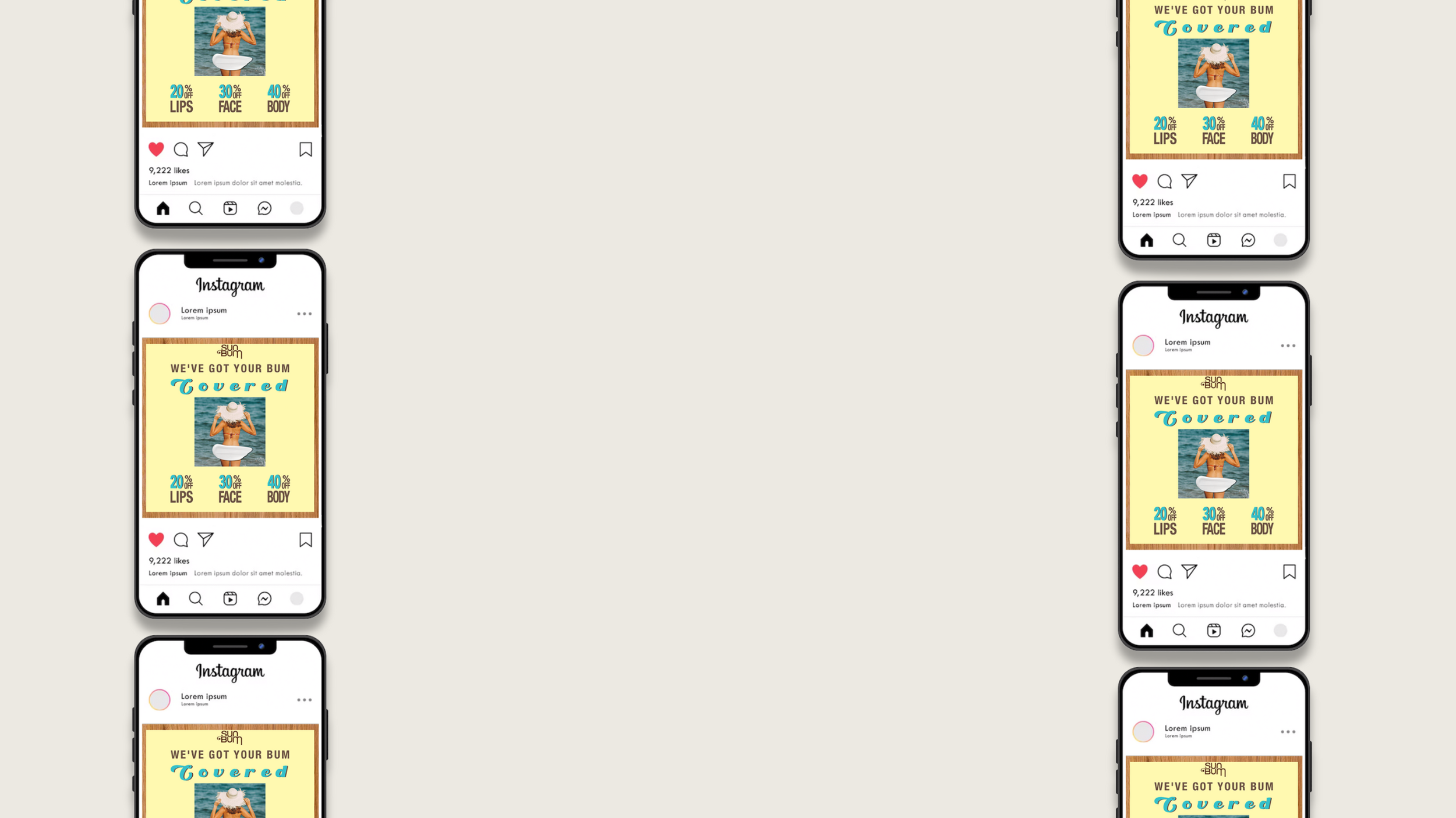
Variations

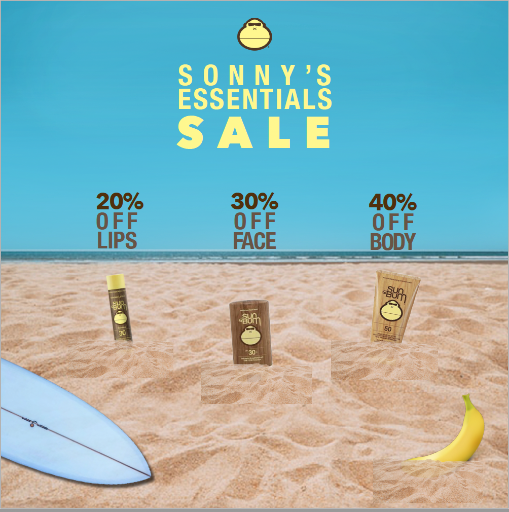

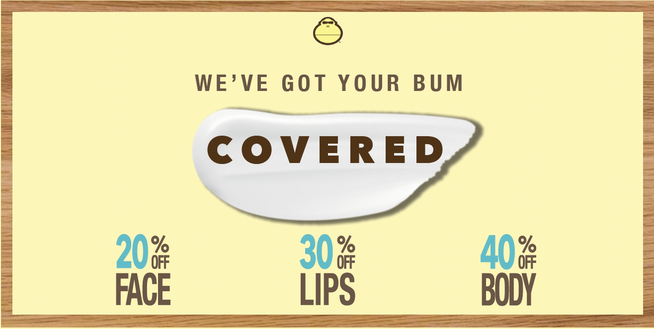


Final Product